
Behind the Build: Wild Souls Wedding Photography
“The most honest photographs happen when you stop performing and start feeling." Wild Souls needed a website that lived by that same rule.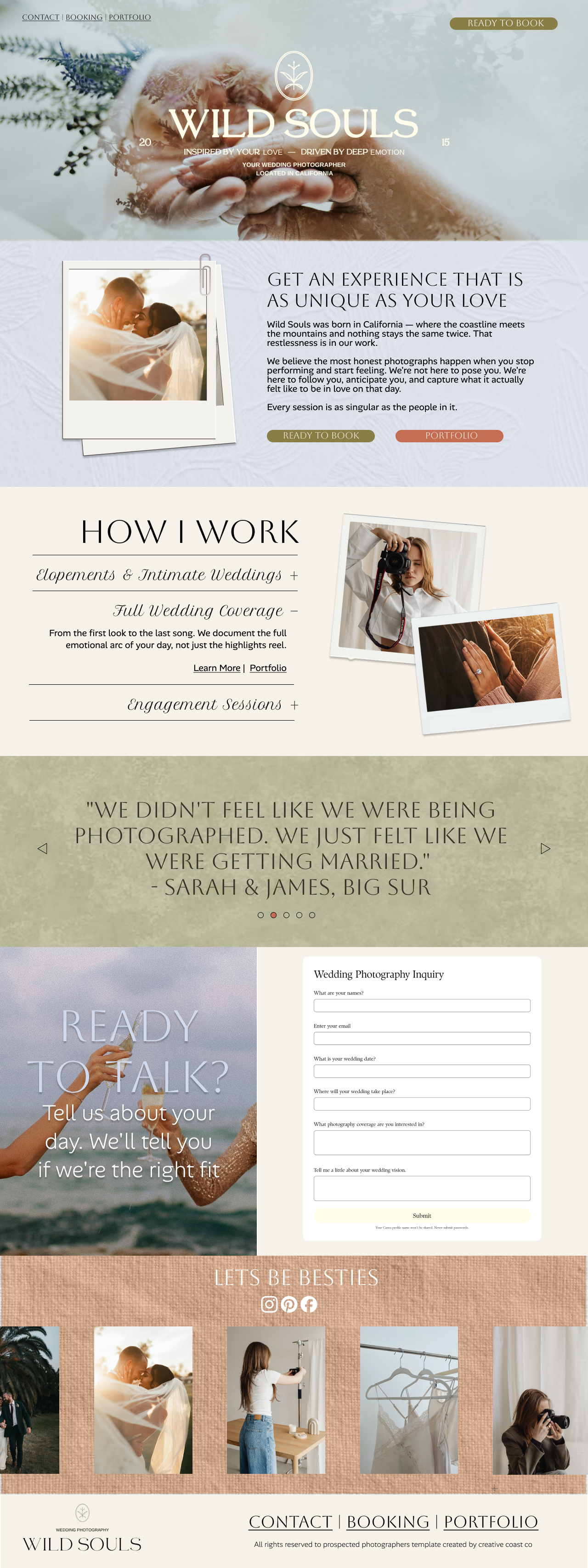
Wild Souls is a California-based wedding photography studio whose work is defined by raw emotion, cinematic light, and a deep aversion to the posed and performative. When they came to me to build their web presence, the challenge was clear: create something as honest and atmospheric as the photographs themselves.
This case study walks through every section of the build — the design thinking, the copy decisions, the structural choices — and shows how each piece serves the brand.
Design decision: The hero does zero selling. It creates atmosphere. The copy, the navigation, the CTA — all of it is restrained on purpose. Trust is built before the pitch begins.
The Hero: Setting the Atmosphere Before a Word is Read
The homepage opens with a full-bleed photograph — hands intertwined, mountain mist, warmth bleeding through cold — overlaid with the Wild Souls wordmark. The brief was not "make it pretty." It was: make a stranger feel something in under two seconds.
We positioned the logo and tagline centrally, with the navigation deliberately understated. The "Ready to Book" CTA is isolated top-right in rust — warm, not aggressive. The hero communicates availability without pressure.
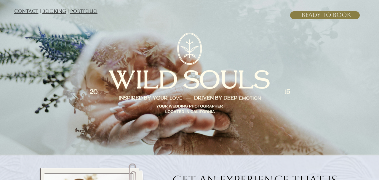
The About Block: Credibility Through Story, Not Bio
Most photographers' "about" sections read like a résumé. Wild Souls reads like a philosophy. The headline — "Get an experience that is as unique as your love" — is not about the photographer. It's about the client. That's intentional.
The body copy establishes the brand's core belief: authentic images happen when couples stop performing. It creates immediate self-selection — couples who want stiff, formal portraits feel warned off; couples who want something real feel found.
The polaroid-style photo treatment reinforces the brand's analog, tactile warmth. It signals: this is not a commercial operation. This is a person.
Typography
All-caps serif headings paired with lean body text. Serif communicates timelessness; the tracking signals editorial confidence rather than corporate polish.
Button Hierarchy
Two CTAs: sage green (book) and rust (portfolio). The primary action leads; the secondary offers an escape for the not-yet-ready. Neither dominates.
UX note: Expanding all three at once would overwhelm. The accordion keeps the section scannable and lets curiosity do the selling. "Learn More | Portfolio" links within the expanded panel give an exit path that continues engagement.
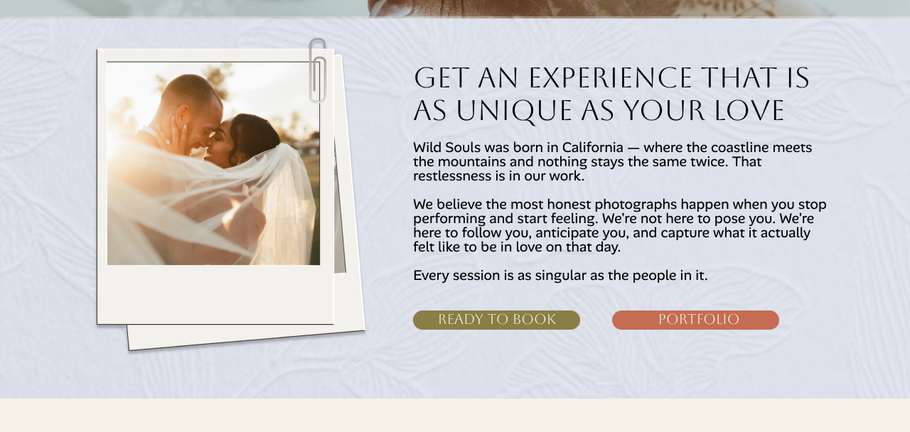
How I Work: Accordion Clarity for Service Structure
The "How I Work" section addresses a structural challenge common to photography sites: multiple service tiers that must coexist without creating visual noise or decision paralysis.
The solution is a simple accordion — three categories (Elopements & Intimate Weddings, Full Wedding Coverage, Engagement Sessions) that expand on click. This respects the user's attention: you see what's available, you open what you need. The default expanded state (Full Wedding Coverage) immediately surfaces the most popular offering.
Stacked polaroid-style images in the right column reinforce the brand, while the left column does structural work. The asymmetry is purposeful — it creates movement without chaos.
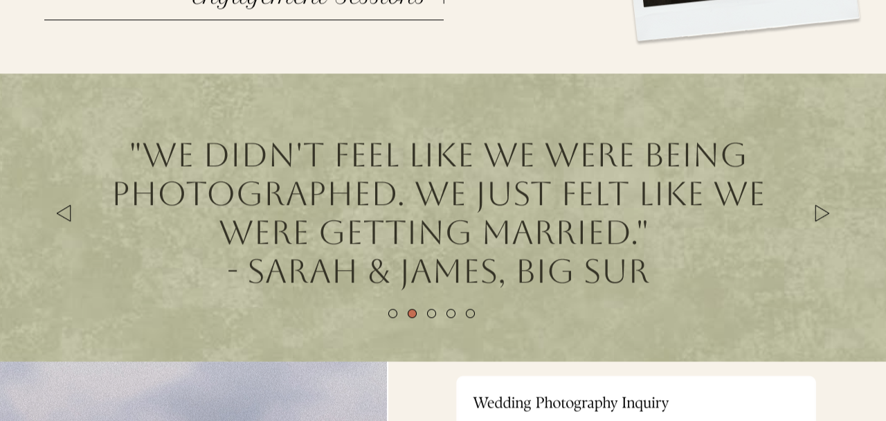
The Testimonial: One Voice, Maximum Weight
Most sites cram three or four testimonials into a grid. Wild Souls uses one full-width, large-type, sage-green background. The effect is closer to a magazine pull quote than to a review section. It commands attention and earns belief.
"We didn't feel like we were being photographed. We just felt like we were getting married." — That's not a review of photo quality. It's a review of an experience. And it's the single best summary of the brand promise in the entire site.
The carousel dots below suggest more testimonials exist without cluttering the current view. They invite curiosity rather than demanding attention.
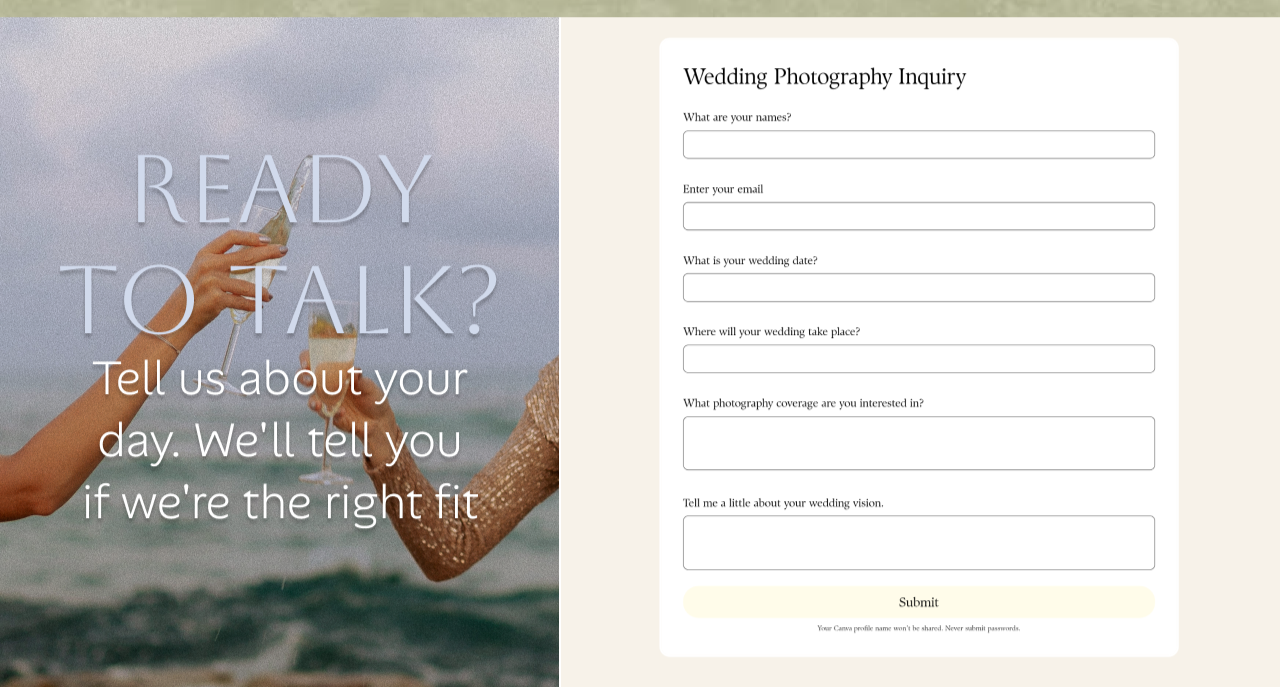
The Contact Form: Friction as Filter
The inquiry form collects more than most photographers ask for up front: names, email, wedding date, location, coverage interest, and a vision field. That's intentional friction — it filters out casual browsers and surfaces serious inquiries. Anyone who completes it is invested.
The left-panel copy — "Ready to Talk? Tell us about your day. We'll tell you if we're the right fit." — is among the sharpest lines on the site. It positions the photographer as selective rather than desperate. That reframes the relationship before a single word is typed into the form.
Psychology of Selectivity
Saying "we'll tell you if we're the right fit" signals the photographer is choosing clients — not just accepting anyone. This raises perceived value and attracts couples who want to feel chosen.
Form Field Strategy
The "vision" field at the bottom is the most important field on the form. It reveals personality, expectations, and communication style — before a single call is made.
The Visual System: Colour, Type & Texture
Every design decision on the Wild Souls site traces back to the same source: the feeling of golden-hour California light. The palette was built from that single reference point.
Deep Bark
Sage
Warm Clay
Linen
Rust
Serif for Moments
Headings use a high-contrast serif — alternating between all-caps weight and italic delicacy. This typographic contrast mirrors the emotional range of the work itself.
Polaroid Motif
Images throughout the site are treated as physical polaroids — slightly rotated, drop-shadowed, with paper-white frames. It's a deliberate analog signal in a digital space.
CTA Restraint
Two CTA colors are used throughout: sage (primary booking actions) and rust (secondary portfolio/navigation actions). They never compete; they always point in a clear direction.
Section Rhythm
Sections alternate between cream, warm white, and sage backgrounds — creating a breathing rhythm as you scroll. No two adjacent sections share the same ground color.
What the Build Achieves
The Wild Souls website doesn't try to convert everyone. It tries to deeply resonate with the right people — emotionally present couples who want documentation over direction, feeling over formula. Every structural decision, every copy line, every typographic choice, and every interaction is in service of that single aim.
The result is a site that qualifies its visitors. By the time someone submits that inquiry form, they already understand the Wild Souls philosophy, believe in the Wild Souls approach, and have self-selected as someone this photographer actually wants to work with.