
From Court to Brand: How We Built Mia & Maple's Entire Identity Around a Feeling
There's a version of pickleball branding that plays it safe. Sporty fonts. Action shots. Maybe a neon accent color. Generic enough to feel "athletic," forgettable enough to disappear by the end of the scroll.
That was never the brief for Mia & Maple.
When this project landed on our desk, the ask was deceptively simple: build a brand for a women's pickleball lifestyle company that felt elevated, personality-forward, and completely ownable. Something that lived at the intersection of the country club and the girls’ trip. Sporty, but make it fashionable.
Here's how we got there.
The Strategic Foundation: Who Is She?
Before a single color was chosen or a typeface pulled, we had to get crystal clear on who Mia & Maple were talking to.
She's not just a pickleball player. She's the woman who shows up to the court in a coordinated set, who buys the aesthetic paddle because yes, performance matters — but so does the photo. She's competitive and social in equal measure. She takes the game seriously without taking herself too seriously.
That last part became the brand's north star: serious about quality, playful about everything else.
It's what unlocked the entire visual direction — and, honestly, it's what made the "In a Pickle" sock possible.
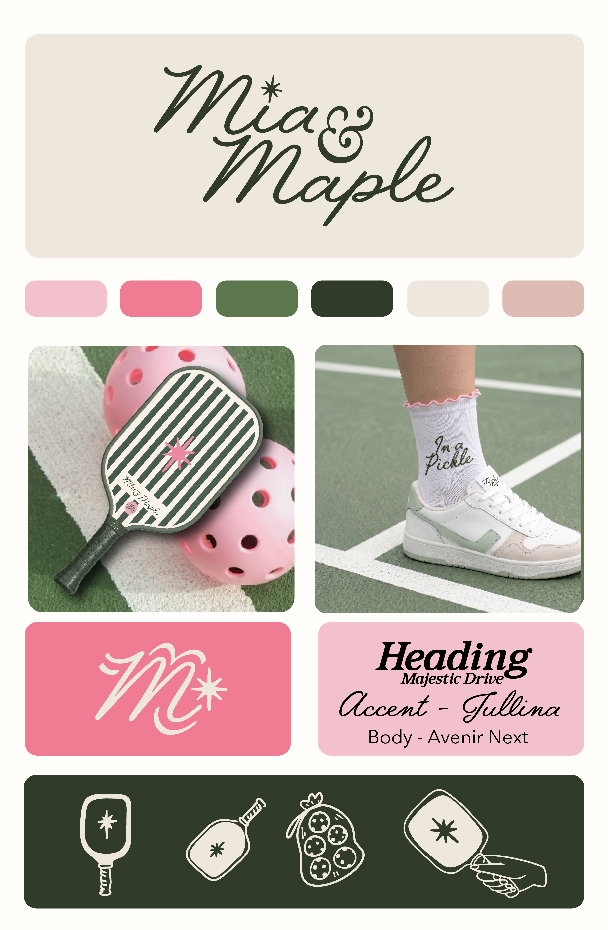
The Color Story: Pretty With a Point
The palette was the first major decision and one of the most intentional.
Pink and green is not a new combination — but the specific pink and green matters enormously. We went with a warm, bubblegum-adjacent pink paired against a deep forest green that leans almost vintage. Not a bright, sporty lime. Not a dusty sage. A green with depth and a little bit of old-money energy.
The result is a palette that reads as:
Feminine without being precious
Sporty without being loud
Elevated without being cold
We rounded it out with a warm cream and a soft blush to give the system breathing room and flexibility across applications — because a brand that only works in one combination isn't a brand system, it's a logo.
The Typography: Three Voices, One Personality
One of the areas where brands most often go wrong is treating type as an afterthought. For Mia & Maple, we built a three-tier type system in which each font had a specific role.
Majestic Drive handles headlines — bold, slightly retro, with the confidence of a vintage sports brand that's been cool since before you were born.
Jullina steps in as the accent script — the handwritten warmth that shows up on product ("In a Pickle"), in taglines, in moments that need personality and intimacy.
Avenir Next keeps the body copy clean, modern, and readable. It's the straight man that lets the other two fonts do their thing.
The combination creates a brand voice in type: classic yet current, playful yet polished.
The Mark: The Star That Does More Than Sparkle
The brand mark — an eight-point star — punches well above its weight in terms of brand equity.
It shows up in the wordmark. On the paddle face. Embroidered on the grip. It's a signature detail that becomes a recognition device across every touchpoint without feeling like a logo slapped on a product.
That's the goal with any good brand icon: it should feel like it belongs to the product, not like it was applied to it afterward.
The script "M" mark on the pink background reinforces this — a secondary asset that works for packaging, hang tags, and social without needing the full wordmark to communicate brand.
The Product Application: Where the Brand Becomes Real
Brand boards are hypotheses. Products are proof.
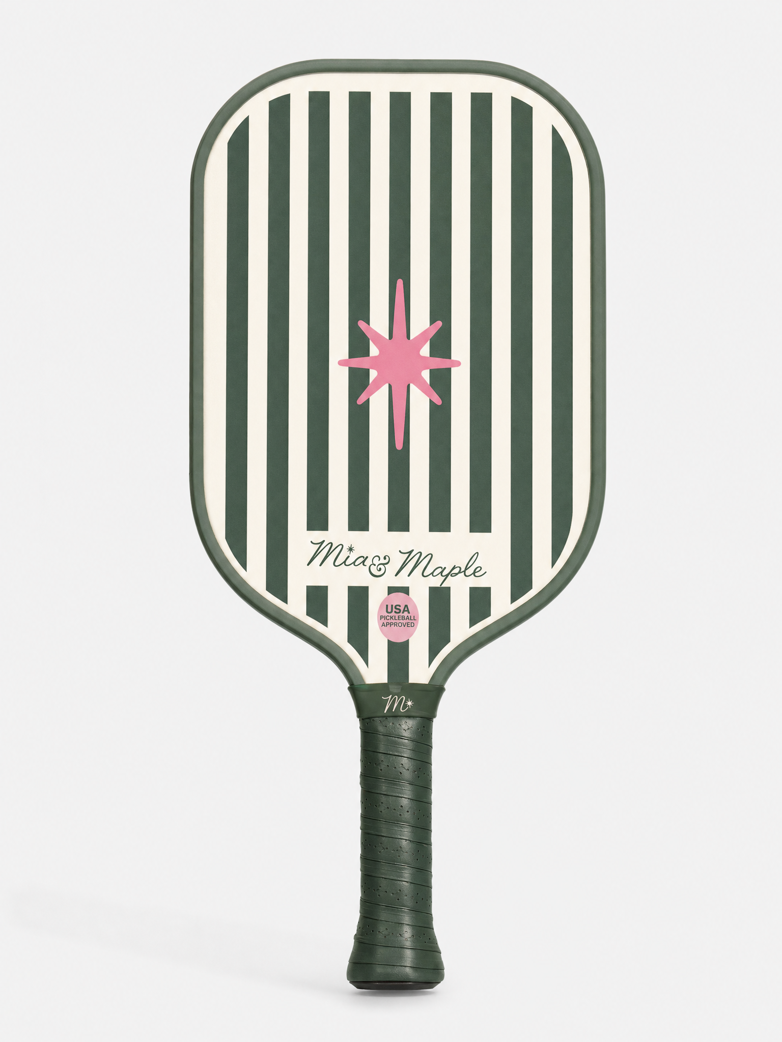
The paddle was our first and most important proof point. Vertical stripes in forest green and cream, centered star, wordmark in that confident script — it's a paddle that photographs beautifully and stands out on a court. It communicates "I have taste" without saying a word.
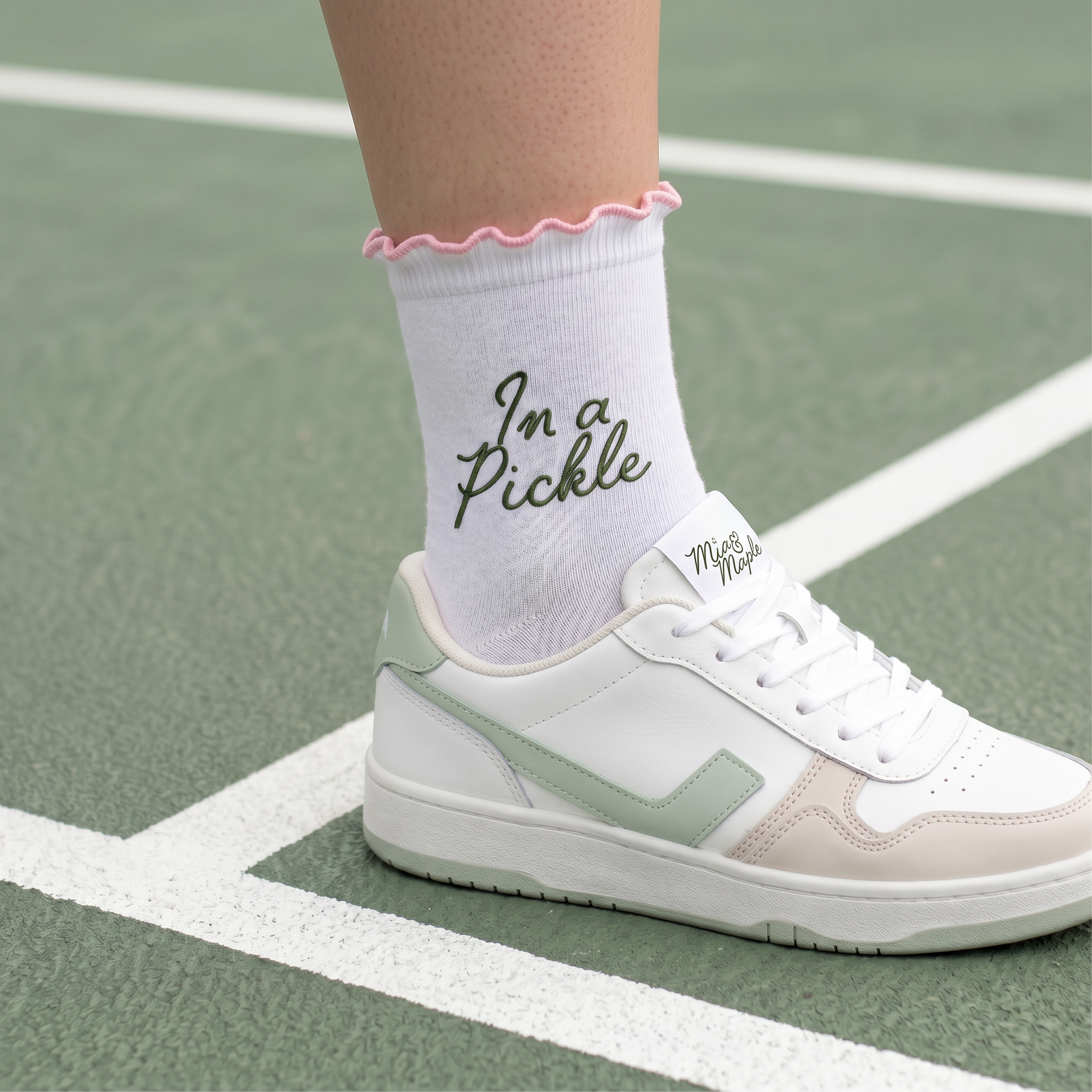
The sock was the brand's personality moment. "In a Pickle" in Tullina script, pink ruffle trim, clean white base — it's a product that makes someone smile when they see it and immediately want to send it to a friend. That shareability is not accidental. It's a brand decision.
The custom illustrated icon set — paddle, ball, hands, star — extends the visual language into digital and packaging without requiring photography. It's the kind of asset library a brand needs if it's planning to actually grow.
The Takeaway: Lifestyle Brands Win on Feeling
Mia & Maple work because every decision point back to the same feeling: I belong here, and I look good.
Not one element was chosen in isolation. The green on the paddle matches the depth of the wordmark. The pink in the palette matches the sock trim. The star in the logo lives on the grip tape. It's a system — and systems are what turn a logo into a brand.
This is the work we love most at Creative Coast Co.: taking a concept with real potential and building it into something that feels inevitable. Like it couldn't have looked any other way.
Interested in building a brand identity for your product-based business? Let's talk.