
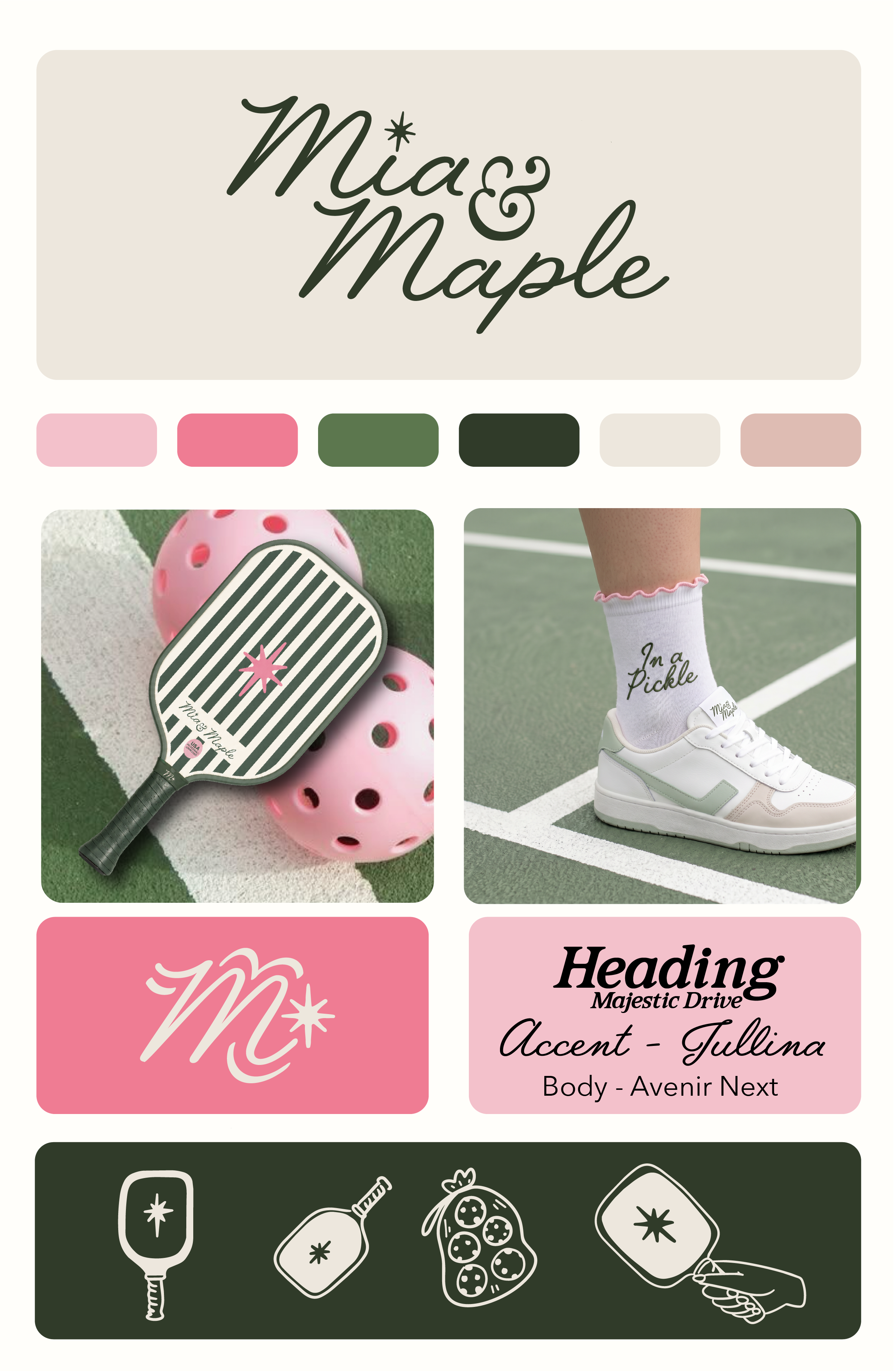
From Court to Brand: How We Built Mia & Maple's Entire Identity Around a Feeling
There's a version of pickleball branding that plays it safe. Sporty fonts. Action shots. Maybe a neon accent color. Generic enough to feel "athletic," forgettable enough to disappear by the end of scroll.
That was never the brief for Mia & Maple.
When this project landed on our desk, the ask was deceptively simple: build a brand for a women's pickleball lifestyle company that felt elevated, personality-forward, and completely ownable. Something that lived at the intersection of the country club and the girl's trip. Sporty, but make it fashion.
Here's how we got there.
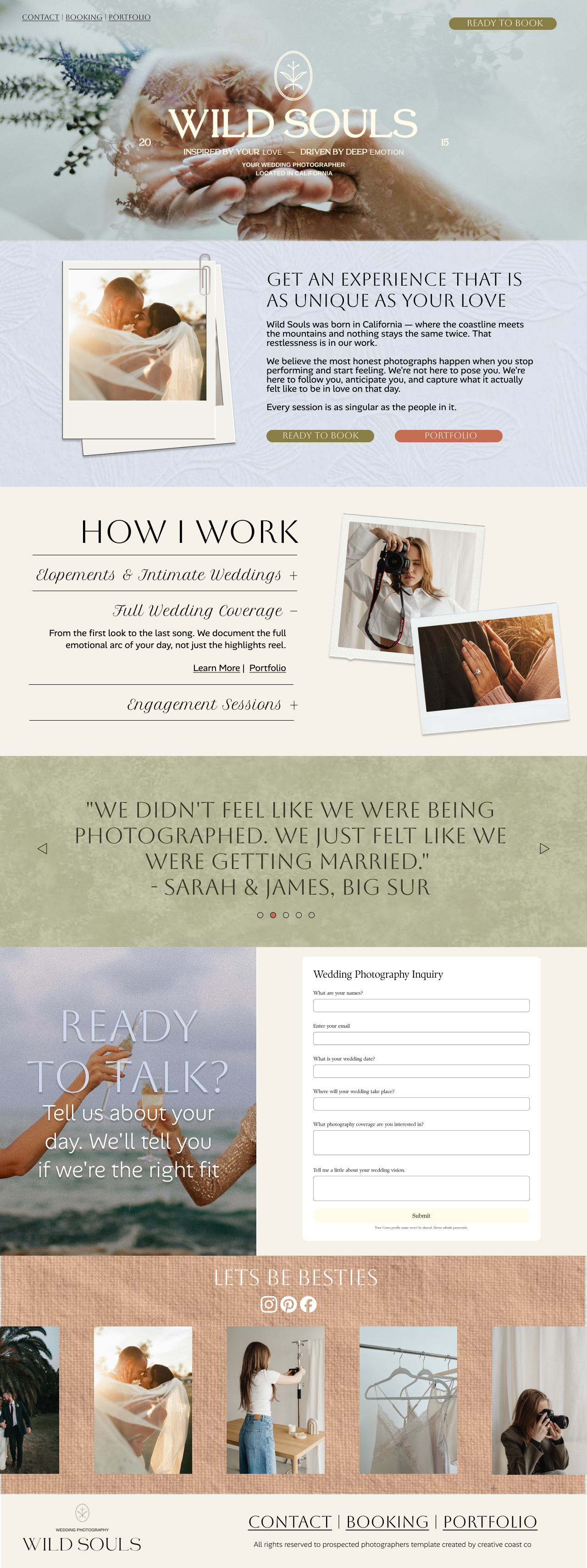
Behind the Build: Wild Souls Wedding Photography
The Wild Souls website doesn't try to convert everyone. It tries to deeply resonate with the right people — emotionally present couples who want documentation over direction, feeling over formula. Every structural decision, every copy line, every typographic choice, and every interaction is in service of that single aim.
The result is a site that qualifies its visitors. By the time someone submits that inquiry form, they already understand the Wild Souls philosophy, believe in the Wild Souls approach, and have self-selected as someone this photographer actually wants to work with.