
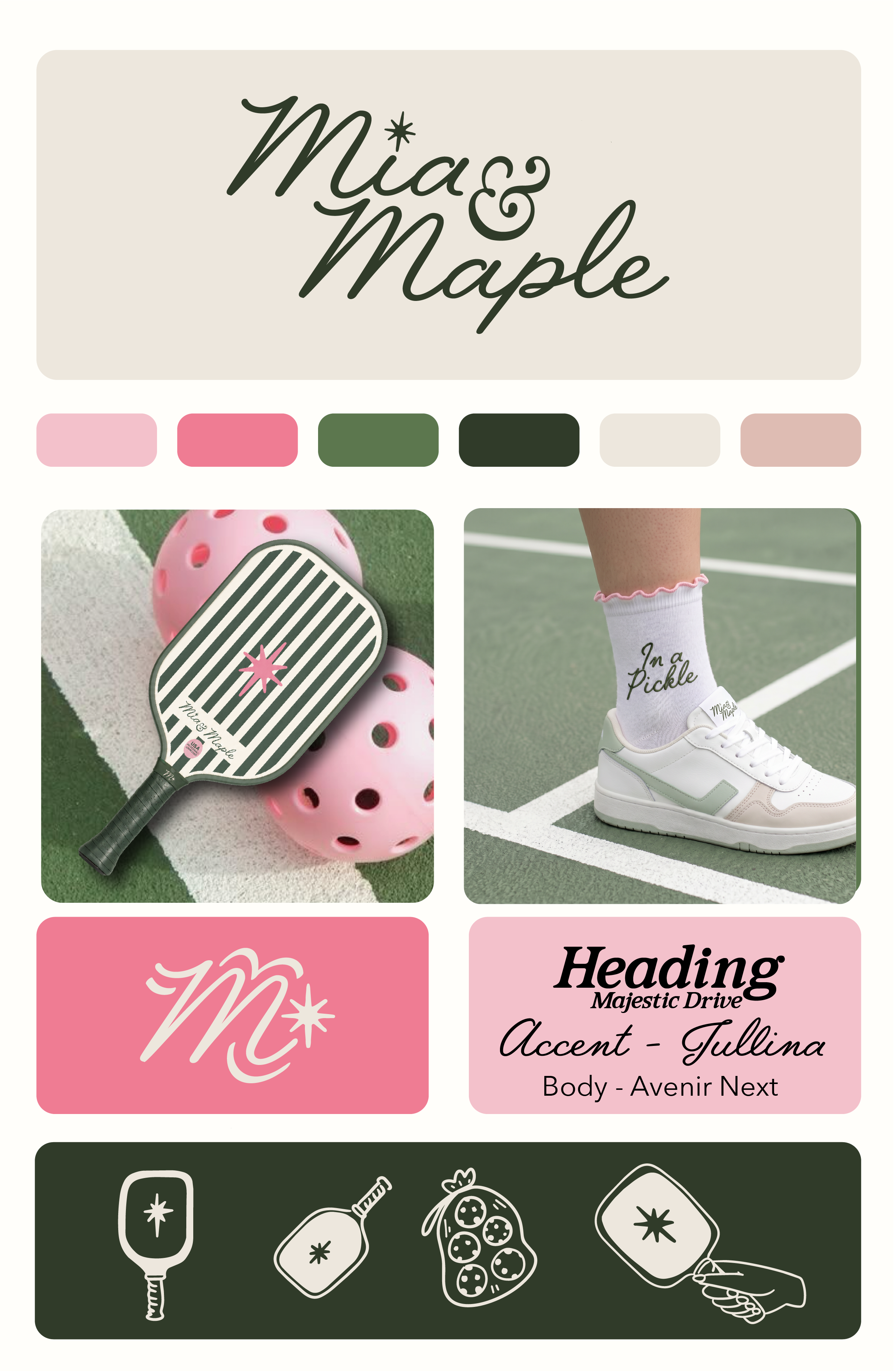
From Court to Brand: How We Built Mia & Maple's Entire Identity Around a Feeling
There's a version of pickleball branding that plays it safe. Sporty fonts. Action shots. Maybe a neon accent color. Generic enough to feel "athletic," forgettable enough to disappear by the end of scroll.
That was never the brief for Mia & Maple.
When this project landed on our desk, the ask was deceptively simple: build a brand for a women's pickleball lifestyle company that felt elevated, personality-forward, and completely ownable. Something that lived at the intersection of the country club and the girl's trip. Sporty, but make it fashion.
Here's how we got there.